wim hof method
ux researcher & ui/ux designer
5 weeks (June-July 2022)
competitor benchmarking
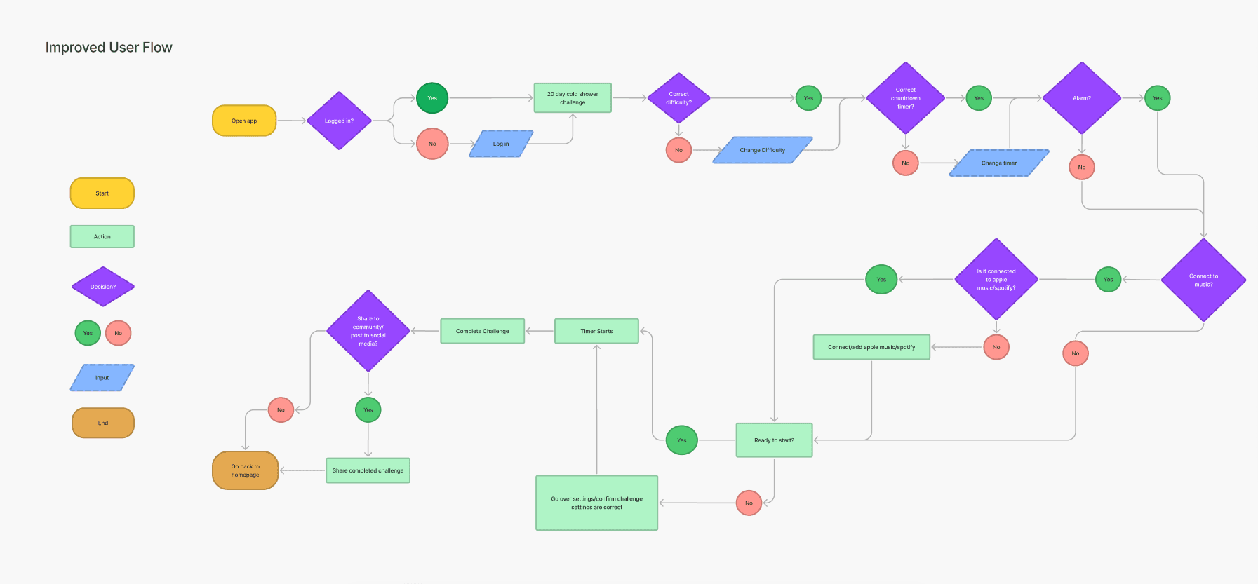
user flows
wireframes
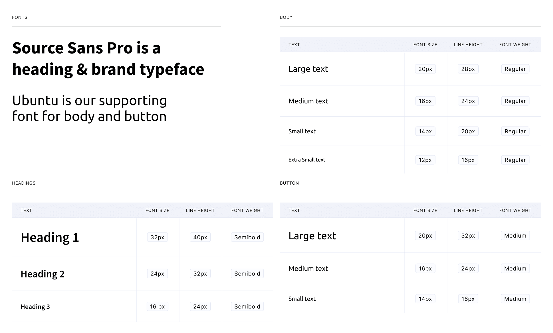
design system
hi-fidelity prototype
user testing
notion
maze
google docs
the wim hof method is a cold water immersion method created by extreme athlete wim hof, boasting benefits such as boosting cardiovascular circulation, a strong immune system, well-balanced mental health, and a high level of energy.
with the wim hof method mobile app, wim aims to encourage those new to cold water immersion to complete a 20-day challenge. during the 20-day cold water challenge, users are invited to pay a monthly or annual subscription to continue their cold water experience.
Increase the rate of new users from free to premium paid plan
2
make the challenge easier to complete with healthy metrics motivating new users’ progress
3
give users the option to journal their daily cold water experience and share with friends
new users of the app would like to easily track their progress
make users feel motivated to complete the cold shower challenge
my team began by conducting a usability review in order to understand the journey as a new user trying the cold shower challenge for the first time. we identified pain points and wow moments within this experience and determined the two following main frustrations:
primary frustration: when first opening the app, users are presented with many options and no clear instruction on what to start with. users are overwhelmed by the information due to the lack of clear layout, organization and hierarchy which results in the users being confused where to begin and may not be able to complete a challenge.
secondary frustration: when users want to change difficulties, all of their previous progress will be lost, so users are frustrated as they have to restart which results in them possibly switching to a more reliable app.
evaluating the competition

clean and minimal design, easy for new users to progress through
some elements of the app are inefficient and tedious, such as having to scroll through long menus (e.g., timer and searching country)
the app is straightforward and easy to navigate. However some features (e.g., music player) does not function well and there is a lack of customization and personalization.

the app is very simple and lacks prompts or guides; it may be confusing for brand new users.
no option to login or create a profile so users may lose their progress if they delete the app or change devices.
available only on android
after we wrote our “how might we” statement, we began our ideation process. we organized our ideas with a mind map and then used an impact/effort matrix to prioritize our ideas. we considered what we could add and what can be improved on with the existing product.


to be improved:
hierarchy
communication
accessibility
to be added:
progress bar on challenge page
checklist for new users
customization
ability to connect to music app
reminders for the challenges


we determined a new color scheme and typeface to be used in the app. for the colors, we found through research that the color green is associated with health, tranquility, power and nature, which seemed fitting for the business.

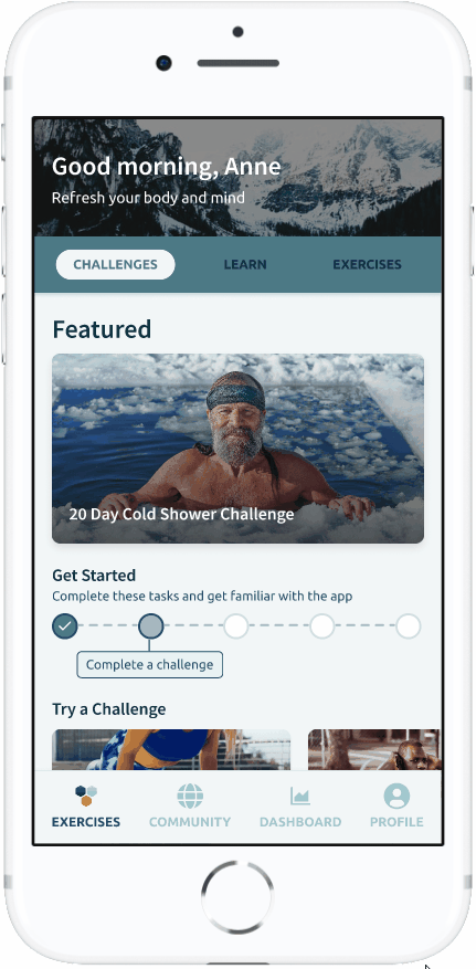
the cold shower challenge is now the main focus on the home screen so users won’t miss it. we also added a progress bar on the challenge page so users can see where they’re at

added a short explanation of each setting for users to better understand. we gave the countdown and cold shower timers different colors to provide contrast
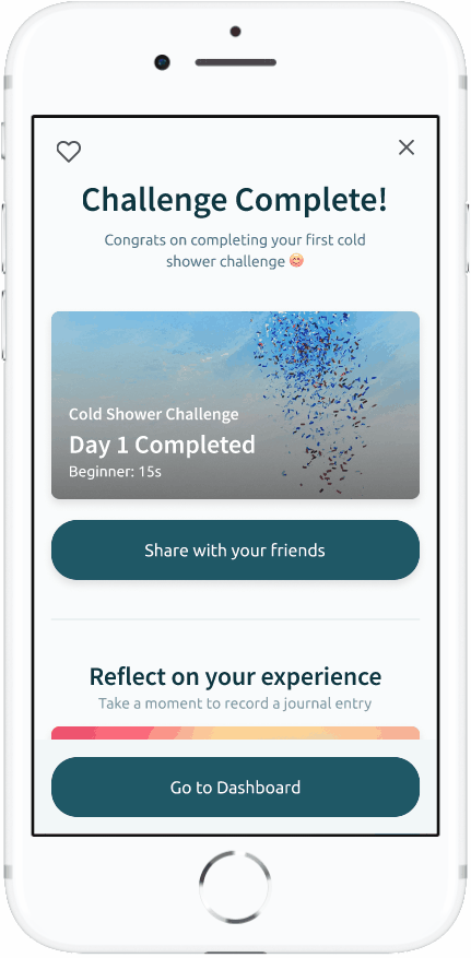
made share with friends option the first card users see. upon clicking on a contact, the message will autofill

users click an emoji pertaining to their mood and have the option to write a note about their experience
once our prototype was complete, we drafted a testing script on maze with scenarios and tasks for real users to complete to validate the prototype. the test ran over the course of 3 days with 33 users, and receiving a total of 21 responses.
generally positive feedback for the homepage
“I liked how it was the first thing that appeared on the exercise page and I did not have to go search for it.”
some users thought there was too much information, making them want to click away
“I wish the paragraphs on the get started page were broken down more, I didn't really feel like reading the long content. Maybe icons or photos to dice up the info would've been more engaging.”
a majority of users struggled with the journaling and were unable to complete the task
“I struggled with the journaling part and wasn’t able to complete the task on my phone, but overall I felt that it was very easy to use and looked aesthetically pleasing and modern”
gained knowledge on the flow of mobile apps and the IOS operating system
this was our first time working with mobile apps so we were able to familiarize ourselves with the flow of app screens and mobile interaction design.
working across different timezones
i worked in a team with a bootcamp classmate who was 13 hours ahead of me so being able to communicate effectively with each other was crucial. we learned to prioritize our tasks and accommodate each others’ timezones for meetings so we could complete our project efficiently.
redesign the journaling feature to make it more intuitive for new users
better reorganize the information on the home screen and cold shower challenge page to be less overwhelming for users