SplitPay
MOBILE / PERSONAL PROJECT / DESIGN SPRINT
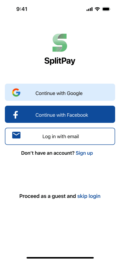
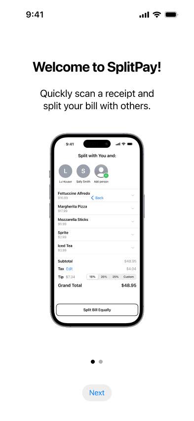
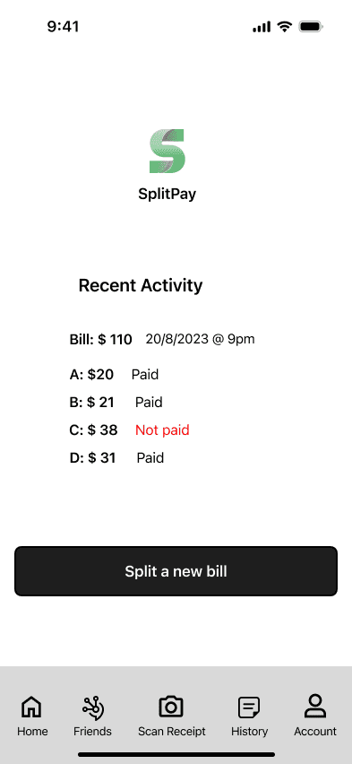
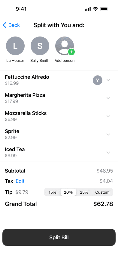
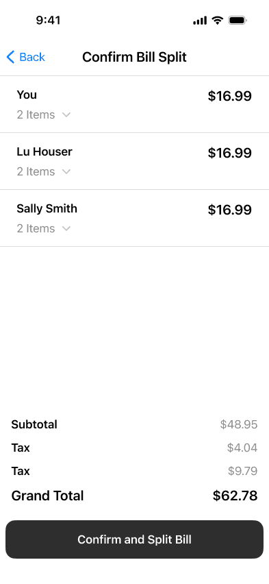
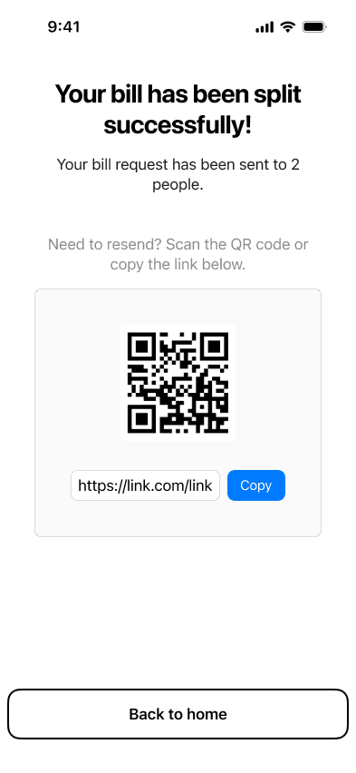
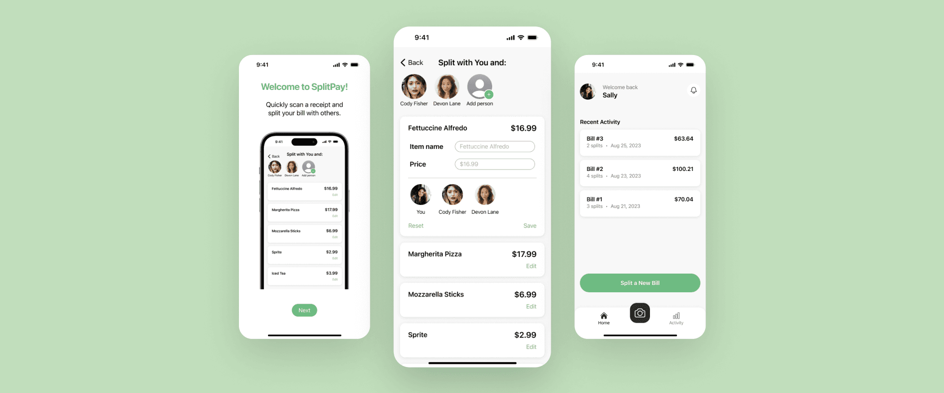
SplitPay is a user-friendly mobile app that makes splitting bills among friends a breeze.
ROLE
Product Designer
DELIVERABLES
Wireframe, High Fidelity Prototype, Design System
TIMELINE
1 week sprint (August 2023)
TOOLS
Figma
BACKGROUND
The idea of this project came from a real-life situation that I'm sure most are familiar with: those moments after settling the restaurant bill, where my friends and I would huddle together, phones in hand, trying to figure out who owes what, including tax and tip. With SplitPay, this process is simplified.
FIVE-DAY PROCESS
Design Sprint
SplitPay was built in just one week, using Google Venture's five-day design sprint process. This method allowed me to rapidly come up with ideas, improve them step by step, and test the design with real users.
DAY 1
Understanding
During the first day of the sprint, I dedicated my time to defining and understanding the problem, competitive research, and user flow mapping.
COMPETITIVE RESEARCH
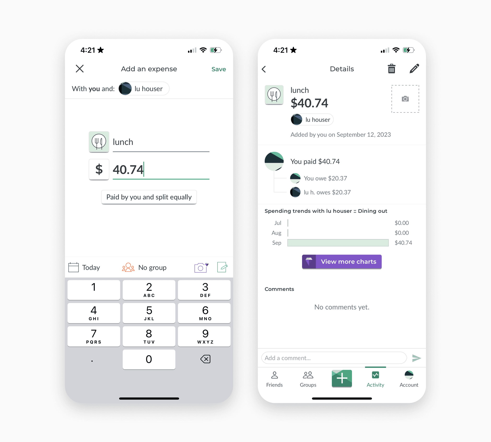
SplitWise
Great at handling large expenses with multiple currencies available.
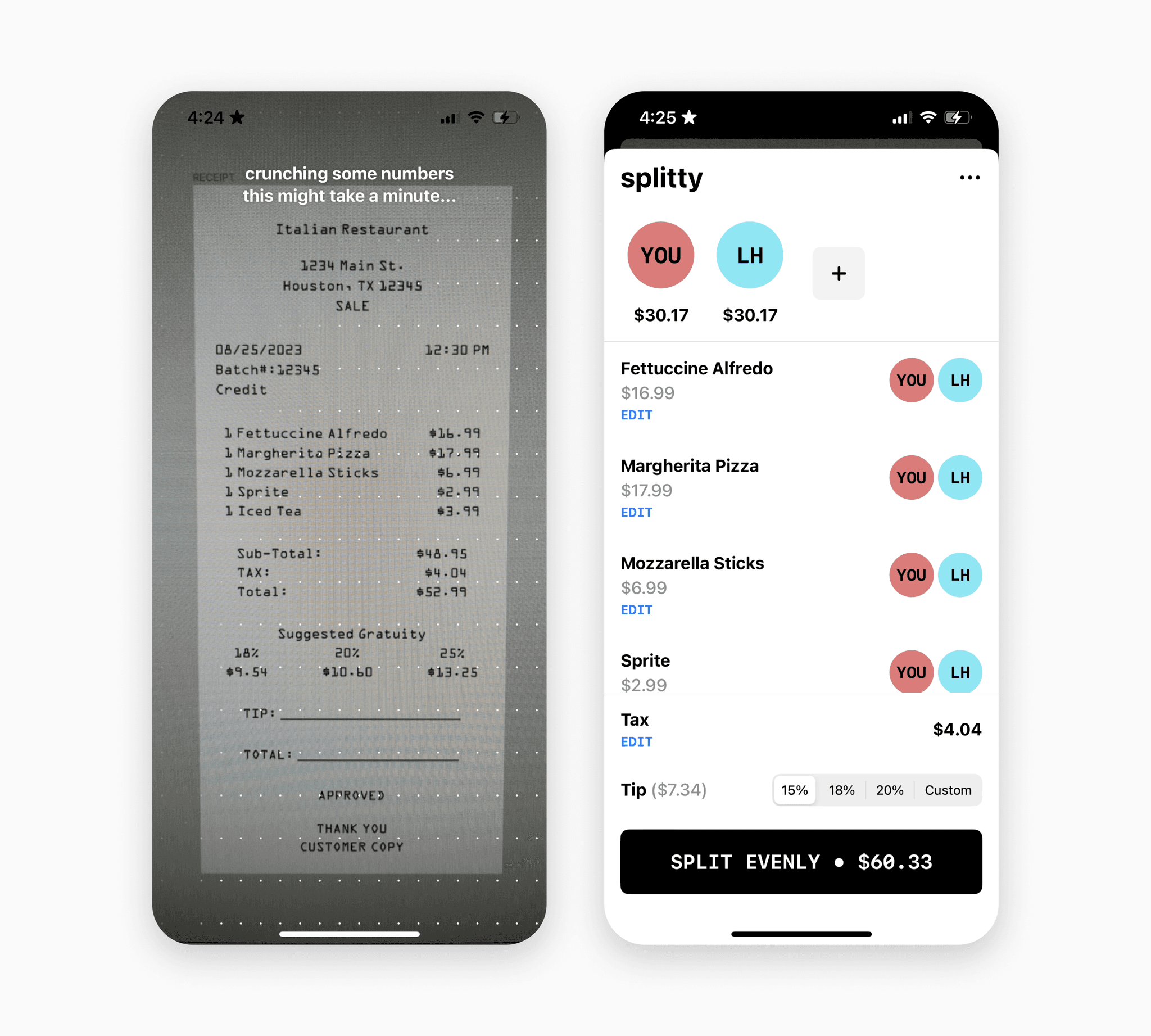
Splitty
Quick and intuitive to use, and has the ability to request payment via Venmo.
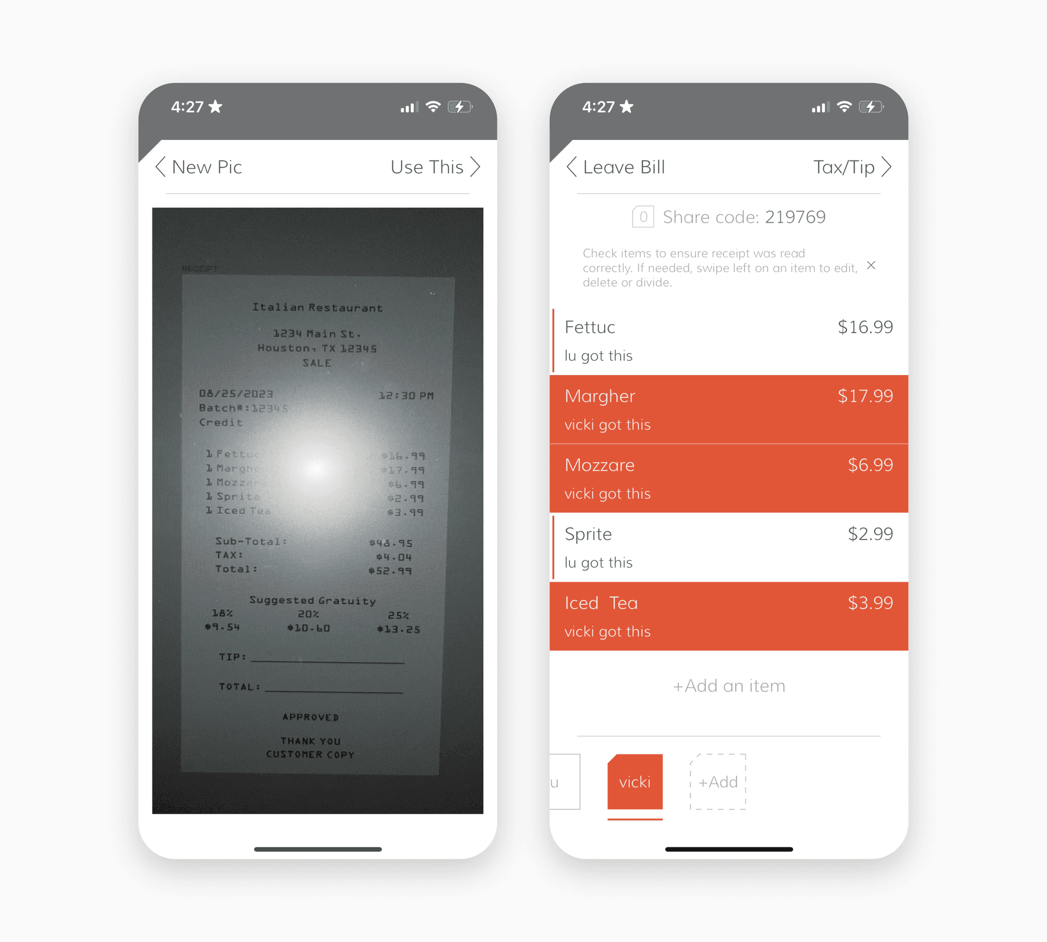
Tab
Simple to use and offers a unique code for each bill.
USER FLOW
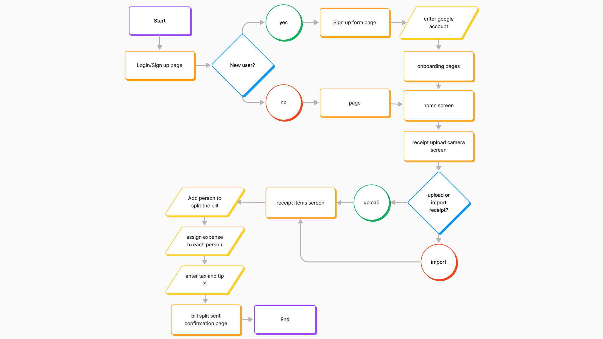
Following the competitive research, I mapped out the possible app user flow.
"How might we ensure that users can split bills fairly between multiple people?"
DAY 2
Sketching
On day 2, I employed the 'Crazy 8's' technique to rapidly ideate and sketch various solution concepts. Additionally, I drew inspiration from the competitive research conducted the previous day to identify areas for possible improvement.
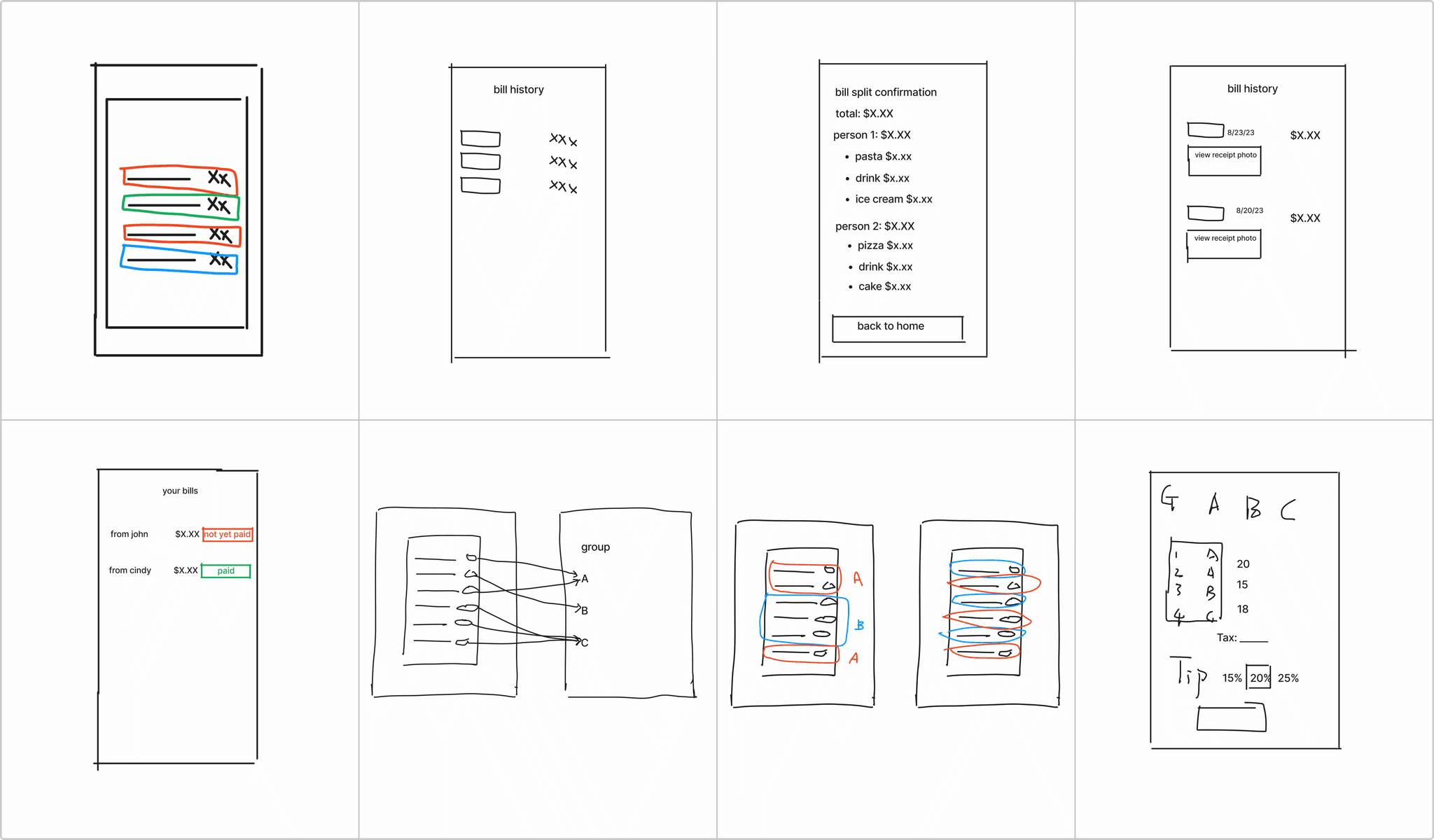
Following the competitive research, I mapped out the possible app user flow.
DAY 3
Deciding
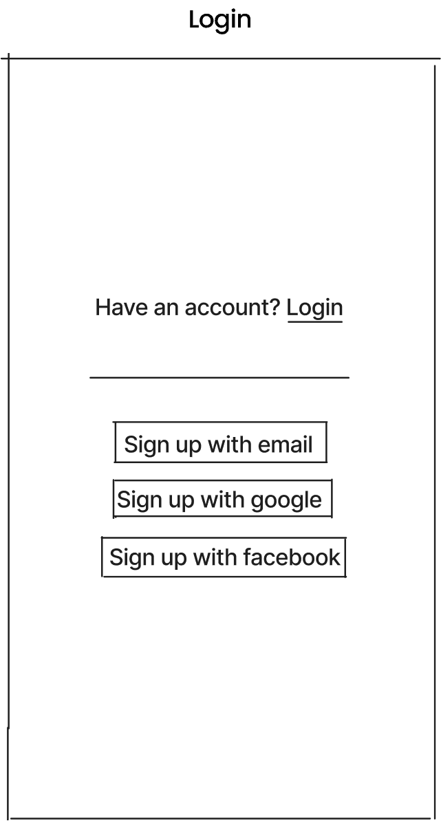
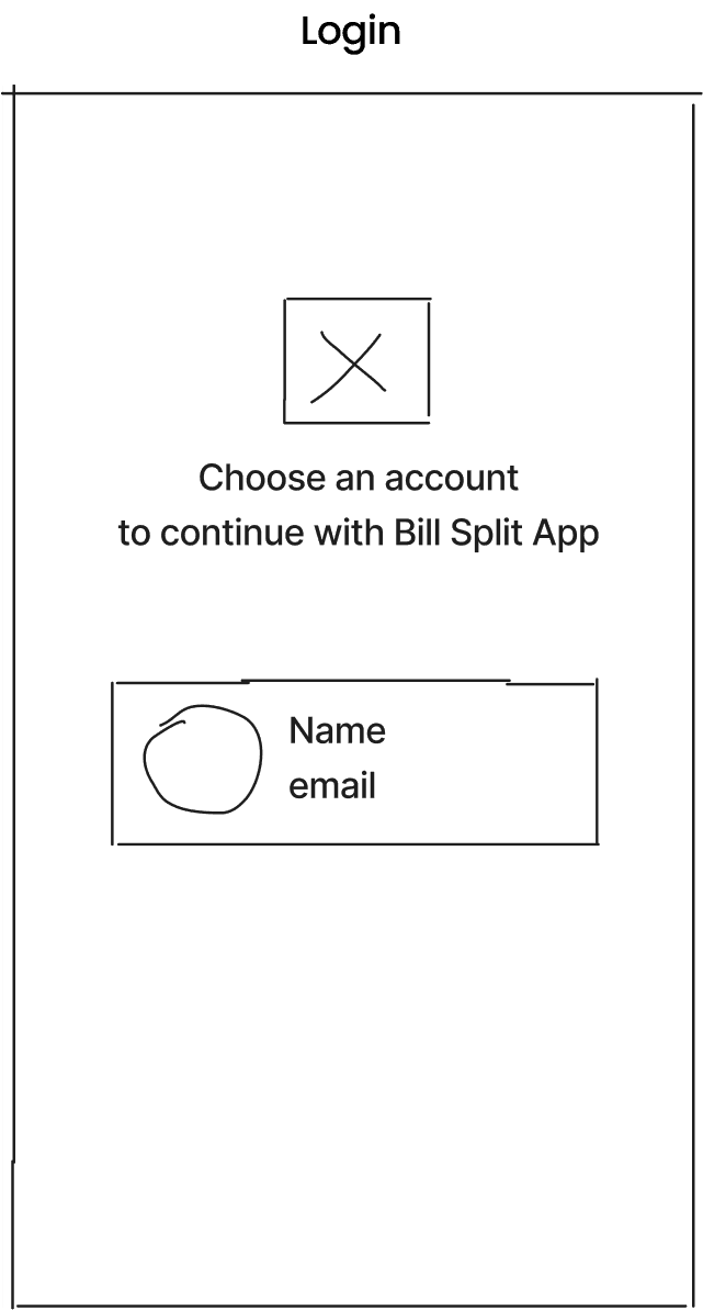
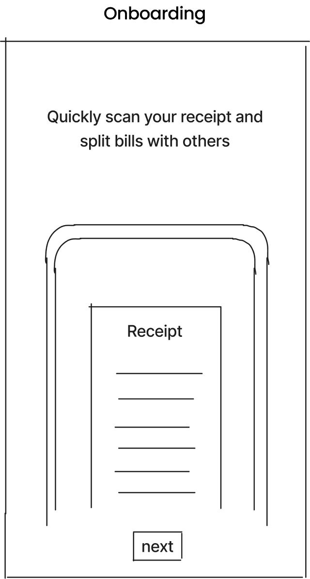
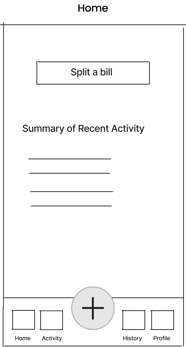
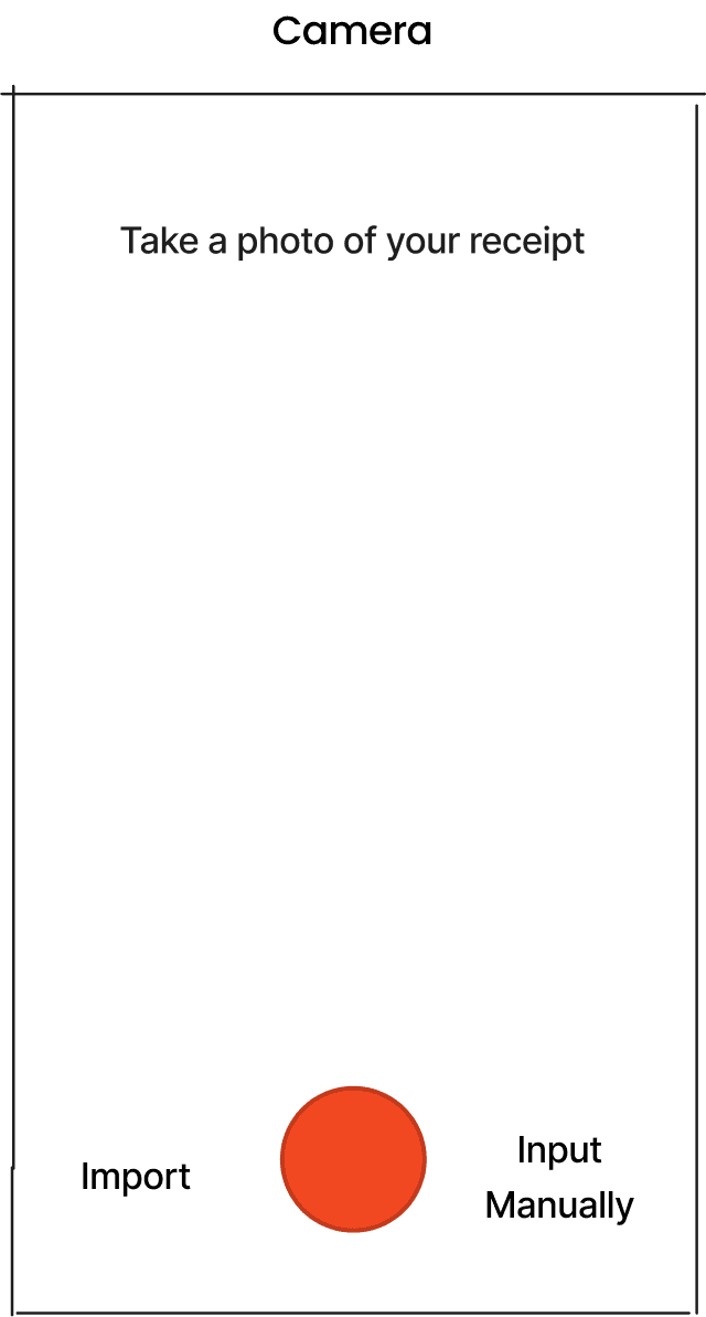
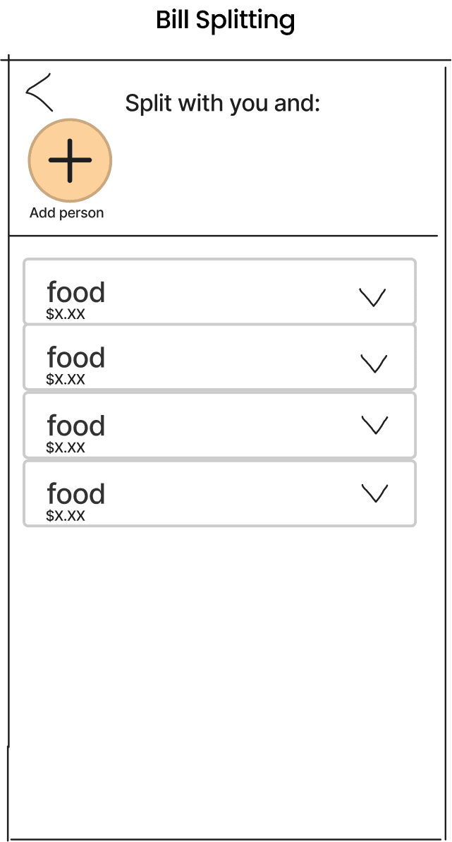
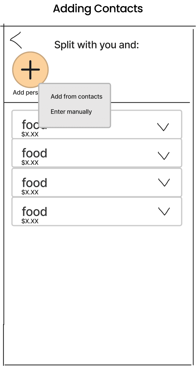
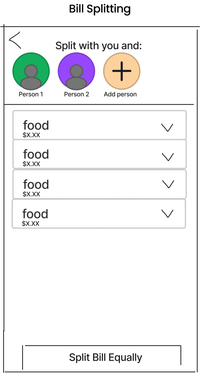
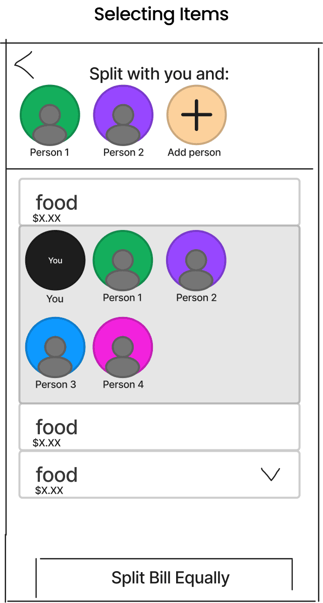
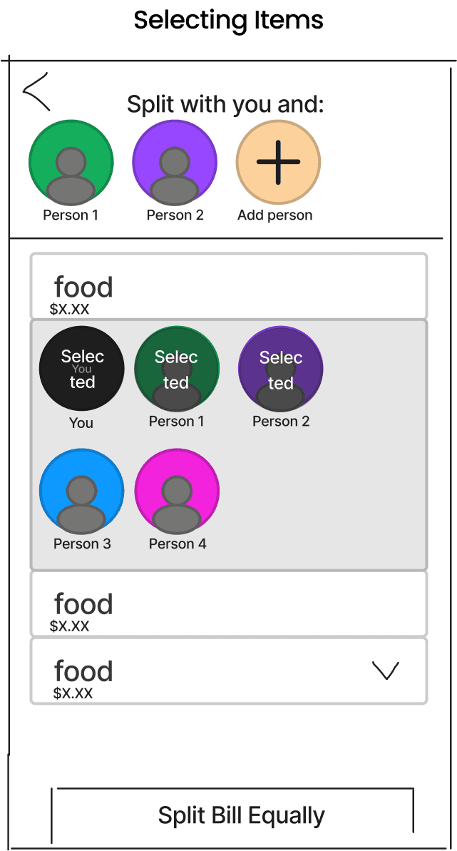
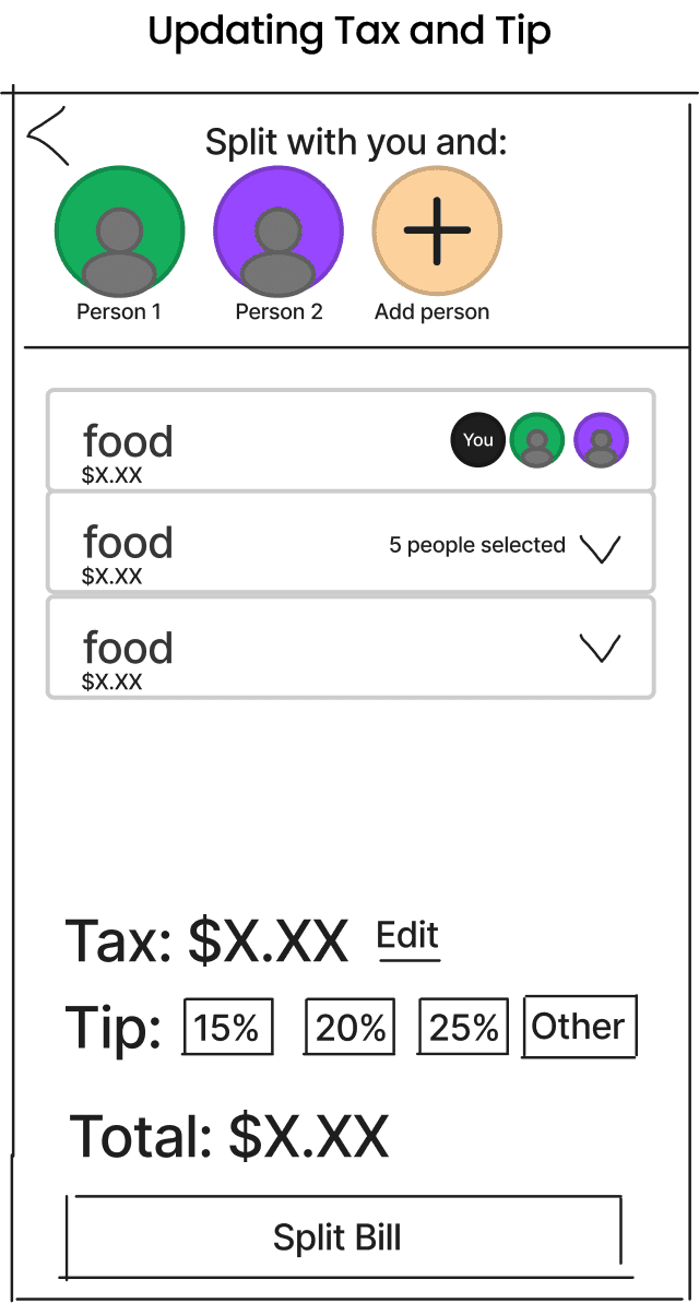
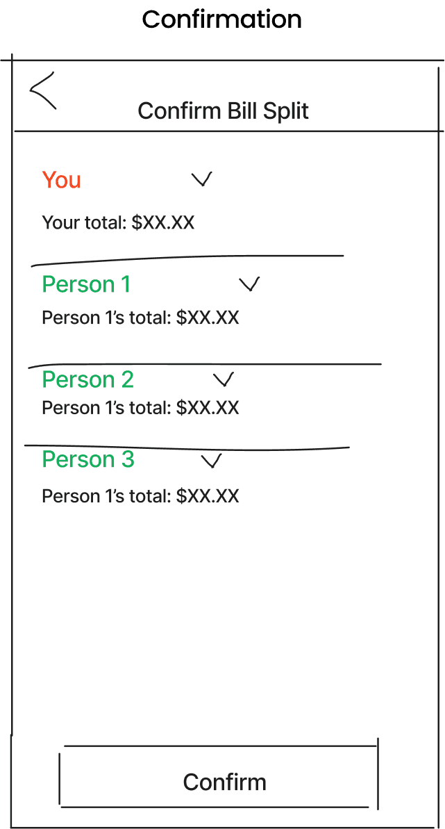
Following the idea generation phase, my teammate and I critiqued each solution and decided on the ones that we thought would be most viable. After that, I began sketching low-fidelity wireframes of the app's layout. We also put together a storyboard to visualize how the app's screens would flow together.
STORYBOARD EXPLORATION
DAY 4
Prototyping
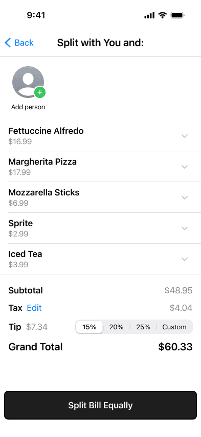
Building upon the low-fidelity wireframes prepared the previous day, I proceeded to craft a mid-fidelity working prototype. This involved creating more detailed screens and adding interactive elements to prepare it for user testing. To expedite the prototyping process, I utilized Apple's official Figma design kit for the first time.
MID-FIDELITY SCREENS
DAY 5
Testing
On the final day of the sprint, I focused on conducting user testing with the mid-fidelity prototype. Six participants were asked to complete various tasks on the prototype and shared their feedback and impressions on the app's functionality and user experience via individual virtual interviews.
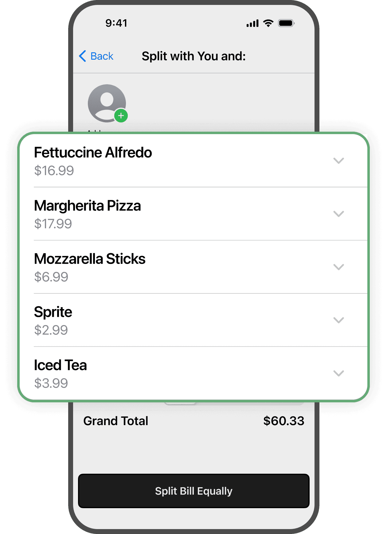
Feedback #1: Lack of option to edit items
Participants expressed concern regarding the app potentially making a error when scanning the receipt, resulting in an incorrect price. One user suggested adding an option to edit the name and price of each item.
Feedback #2: Confusion on assigning items
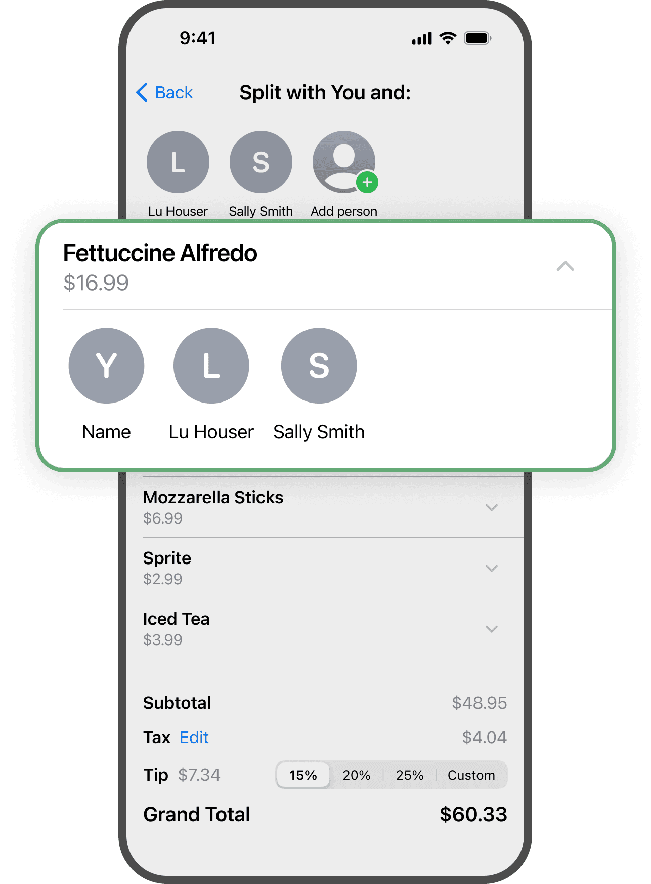
Several participants were unsure about how to assign items to people because they felt there wasn't clear enough guidance or explanation.
POST-SPRINT
Having wrapped up the five-day sprint, I chose to dedicate a few extra days to create a more polished high-fidelity prototype. During this phase, the insights I gained from user testing were integrated into the design to further fine-tune the app's features and functionalities.
DESIGN SYSTEM
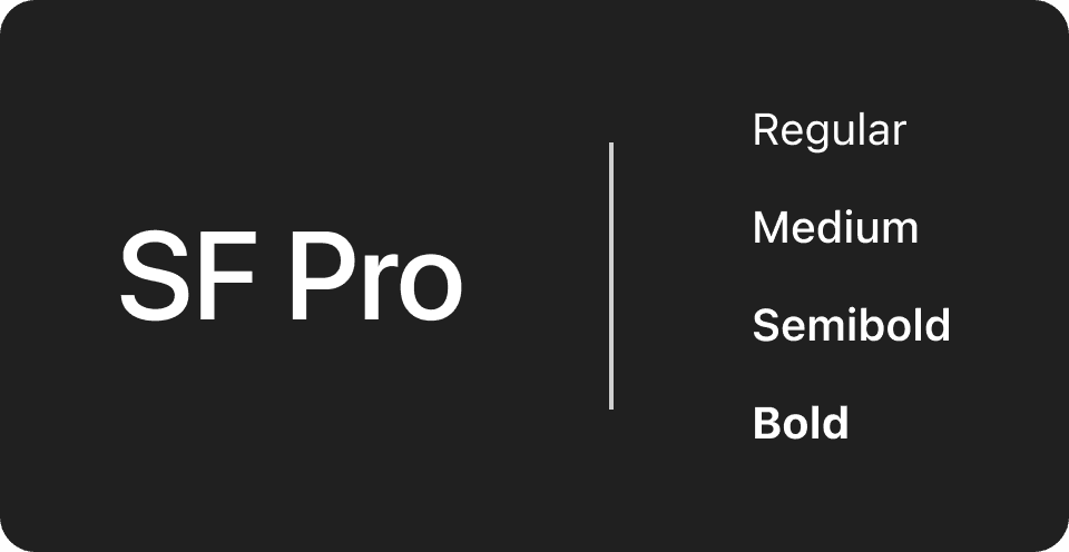
SF Pro was the font of choice to maintain consistency with the IOS design.
#253628
#6EBA82
#C5E3CD
#F8F8F8
Shades of green were chosen as it is often associated with money and wealth.
KEY FEATURES
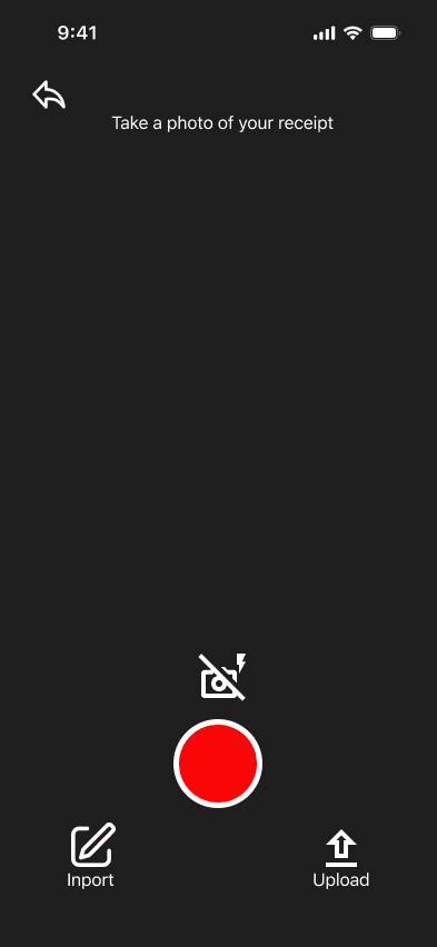
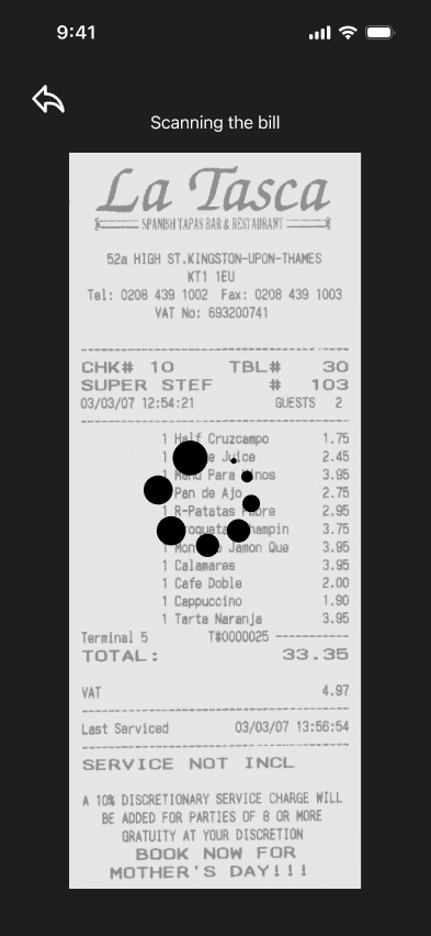
Easily scan a receipt
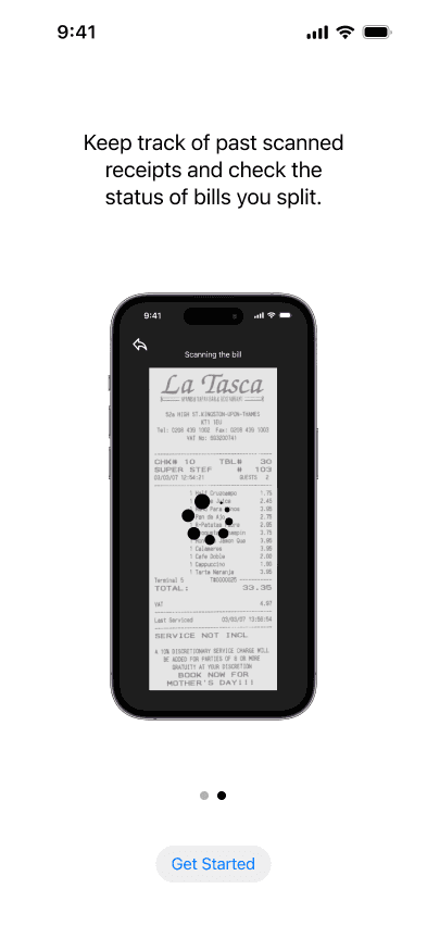
Users scan a photo of their receipt and the app imports the data from it.
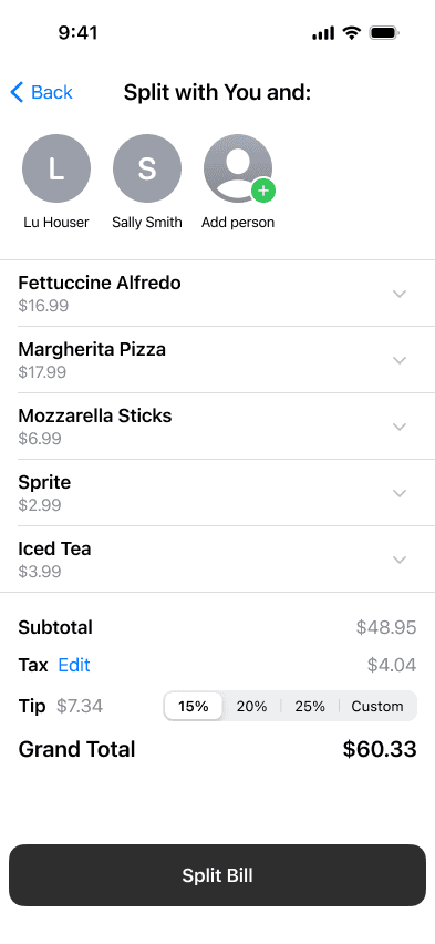
Add friends from contacts
Add the friends you want to split the bill with from your phone's contacts.
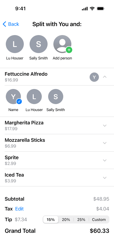
Assign items to friends
With just a few taps, users are able to assign the respective items to each person.
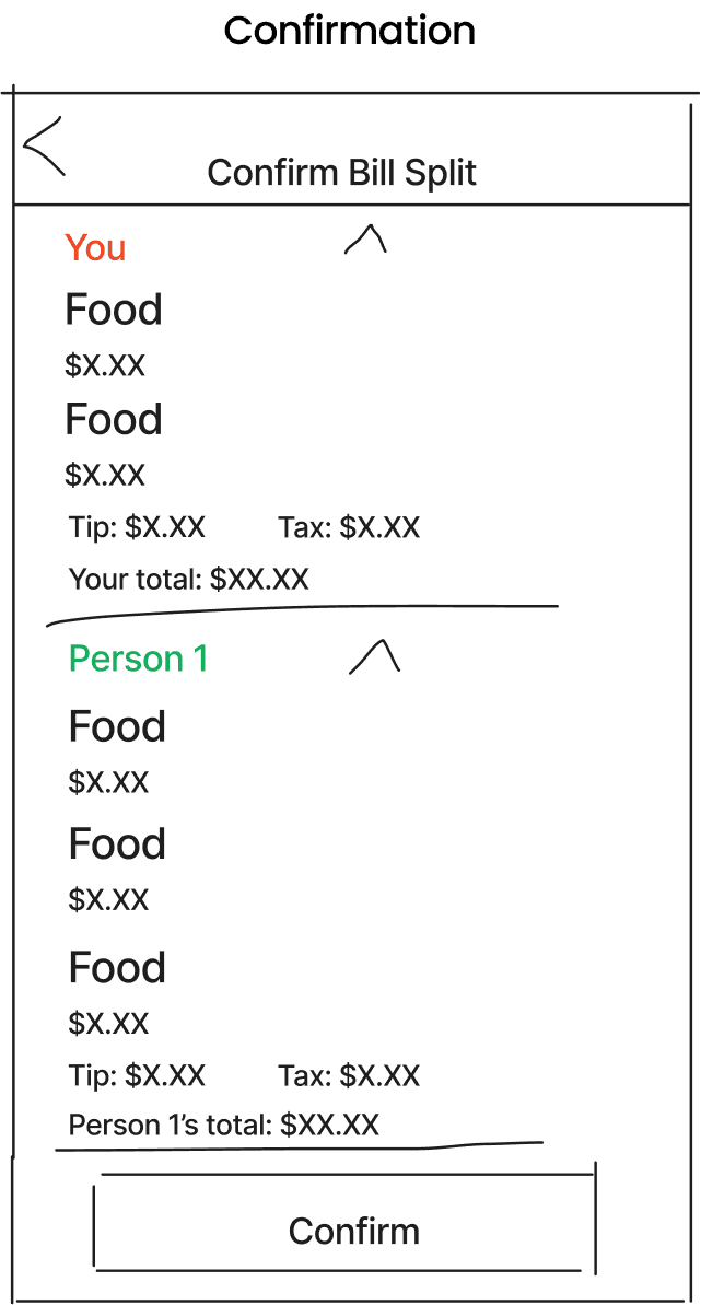
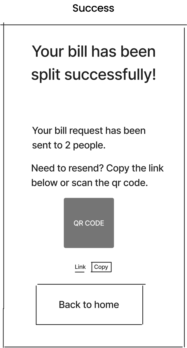
Confirm and split
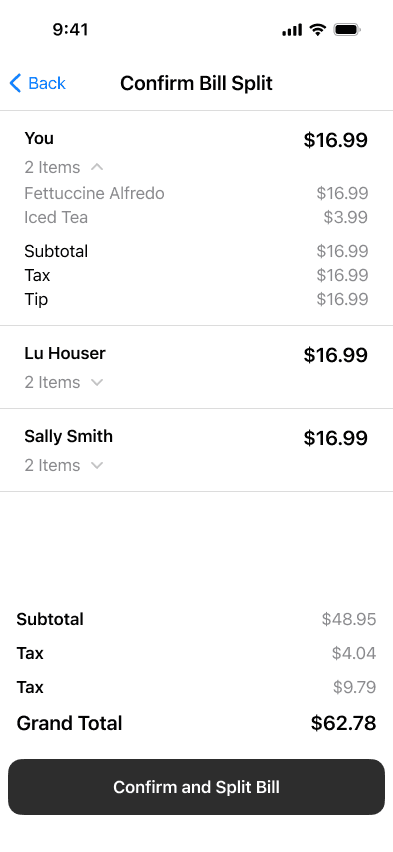
Users can review the split bill a final time before confirming.
CONCLUSION
This was my first time trying Google Venture's five-day sprint, and it showed me how useful sprints can be for quickly coming up with and testing design ideas with users. Because I had only a short amount of time, I had to be mindful of how I organized my work and how much time I spent on each part of the design process.
LESSONS LEARNED
User testing is crucial to understand what works and what doesn't.
Testing with mid-fidelity prototypes simplifies the process of making design adjustments before finalizing a high-fidelity prototype.
