designing a smooth and safe group creation experience for a home sharing platform
team project (2 ui/ux designers)
ui/ux designer & ux researcher
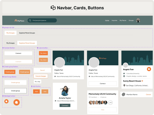
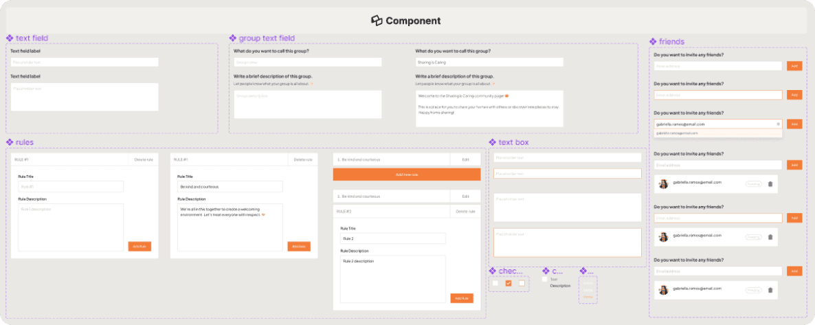
design system
affinity map
user flow chart
wireframes
hi-fidelity prototype
dovetail
google docs
myplace is a social platform to share your home with the people you trust, including your family, friends and your trusted communities and networks. it also allows you to discover new places to stay from your social network.
one of the platform's features is "groups," where users of the same community/network can congregate and exclusively share their homes with each other.
“myplace currently does not have the ability for users to create their own groups; instead, users must request for the myplace team to create a group and one user will be granted admin rights to manage the group.”
business goals
design a group creation experience for users and their communities
allow members to better connect and network with members within the group
empathizing with the users' experience on myplace
to begin our research process, my team conducted a usability review of the current platform to better understand the users of myplace. we went through the account creation flow and navigated through the group pages to identify the pain points of the current experience.
through our usability review, we found that users feel uncomfortable when they are asked to provide their precise location, photos, and description of their homes or places, which in turn causes them to be hesitant to put their homes/places on the site.
problem statement
“new users do not feel safe or comfortable sharing their homes online due to concerns regarding privacy and security. this is problematic as it discourages users to sign up on myplace and add their homes."
learning about users’ motivations and frustrations via interviews
in order to learn more about what users face when sharing their homes, we conducted user interviews with two participants. they shared their feelings and experiences with home sharing, which opened our eyes to how we could provide a safe space for myplace users.
how can we make users feel safe when sharing their homes?
interview questions
- is myplace an entirely new experience for you?
- walk me through a time when you shared your home with someone.
- explain how often you share your home with someone.
- tell me about what factors or concerns you would consider when sharing your home with someone.
- describe a time when someone else shared their home with you.
after gathering the data from the research interviews, we used dovetail to synthesize the information to form an affinity map. we discovered some common trends and narrowed it down to the following:
•
participants share their homes with people they are close to because they feel safe and comfortable with them
•
participants trust that they won't do anything negative
“it’s the sense of security because i know them really well and i know that it’d be okay to let them stay over, whether i’m in the house or not.”
“for strangers, i don’t know if they’ll steal my stuff. will they be clean? what if they break my items or do anything illegal in the room?”

after the interviews, we conducted affinity mapping to combine, organize and draw conclusions from our data.
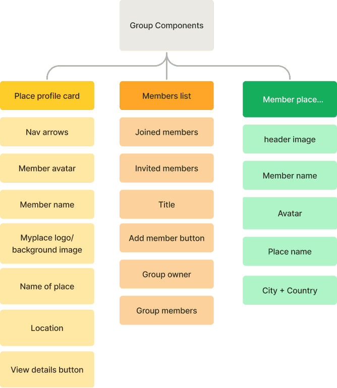
after synthesizing our research interview data, we went on to determine the flow of information with information architecture. we used three different information architecture structures by page, section, and component to figure out the hierarchy for our design.


proposing “how might we” statements to help solve the core problem
once we had a good understanding of the information architecture, we moved onto ideating. in order to focus on our core problem, we wrote down two "how might we" statements:
“how might we provide a smooth and safe group creation experience?”
“how might we make it easy for users to connect with like-minded individuals and build trust within the community?”
brainstorming and determining the best solutions
with the “how might we” statements in mind, we began gathering ideas on what to improve on and add to the current product. we organized our ideas with a mind map, then narrowed our ideas down to a select few that we thought were the most impactful.

top ideas that solve business and user concerns:
•
add group navbar link
•
reorganize homepage hierarchy
•
group rules
•
private group invites
•
users can add personal details (e.g. interests, hobbies)
•
add message button
since group creation currently does not exist for users, we created a user flow based on how we thought the group creation process should go. our goal was to keep the flow straightforward and intuitive.
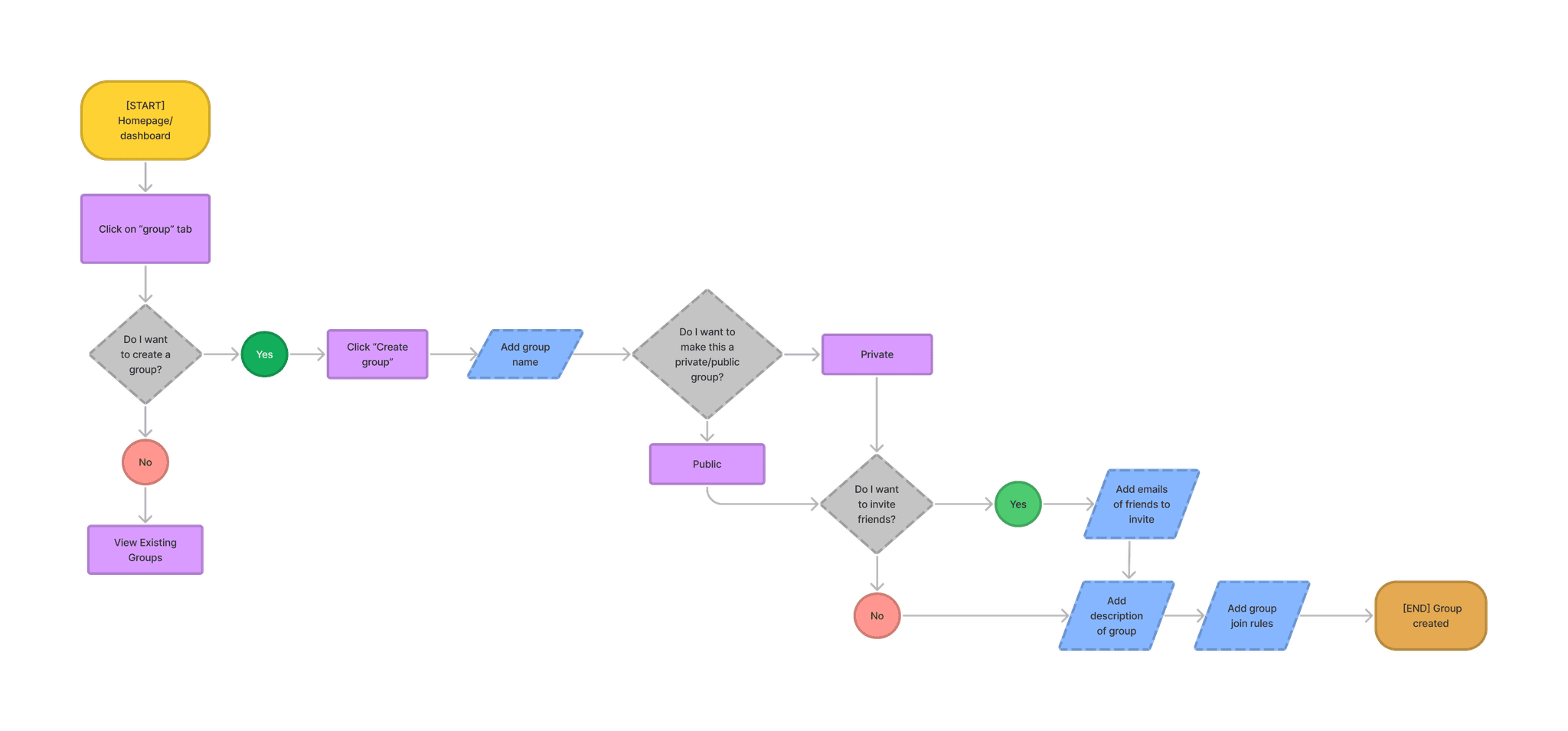
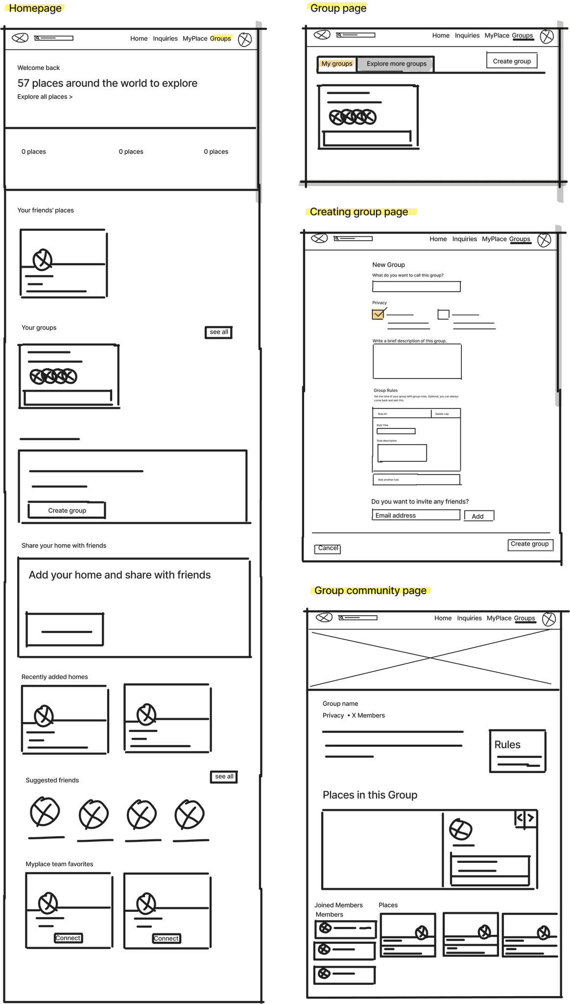
with the new user flow created, we continued by sketching some lo-fi wireframes on figjam to better visualize our ideas and get a feel for how the new experience would be like.
the myplace design team kindly provided us with their design system and brand guide so we did our best to maintain the same consistency. additionally, we derived inspiration based on the existing myplace site to create ui components for our design.


high fidelity prototype
the final designs
homepage with the addition of the groups link in the navbar
the groups page with the newly added group creation button
the new group creation flow with group privacy options and group rules
the updated group page with the addition of rules and group member profile preview
1.
the importance of conducting user research interviews and the difficulties involved
while my teammate and i conducted the interviews separately, we experienced the same issue; the script we prepared did not flow as well as we thought it would, causing us to make impromptu changes to it. since this was our first time conducting user interviews, we've learned that it might be a good idea to test-run our script beforehand to ensure that it flows well.
2.
responsive design is crucial
we also got a better understanding of how responsive ui works. while we were researching and taking screenshots of the myplace site, we realized that the site appeared differently on both of our screens since my teammate's screen is a bit smaller in size. this made us consider how the pages would look on different screens when creating the wireframes.
if we had more time...
the timeline for this project was quite short so my team was mainly focused on churning out the mvp (minimum viable product) of the group creation feature. here are some things that we would love to complete if we had more time.
•
conduct usability testing to ensure that our design effectively solves the business and user concerns
•
add the ability for group owners to add admin roles to help manage the group
•
reach out to the myplace team to gain insight on their design system, site layout and hierarchy, and what they have in mind for the future of myplace